
Top Five List: Punk Rock Logos

Appropriateness is one of the key things when it comes to good logo design. So what happens when being completely inappropriate is the appropriate tactic? You get the punk rock band logo. The main criteria when it comes to the success of a punk rock logo is how well it looks on a black shirt. Pins, patches and stickers also need to be considered, but really it’s that black shirt. Without further ado, here’s my top punk rock band logos:
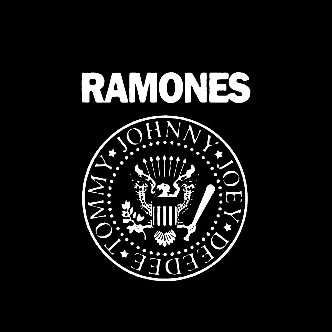
5. The Ramones
The Arturo Vega crafted homage to the All-American band. Using the Presidential Seal as its base, the Ramones logo pays respect and slaps the face of America in one fell swoop. This is art-school brattiness turned up to 11, to steal a line from the decidedly unpunk Spinal Tap.

4. CHIXDIGGIT
Calgary’s positive contribution to pop punk, Chixdiggit’s logo looked like the music sounded. Joyous, over the top and more than a little snotty, the wordmark perfectly encapsulated the band it’s aesthetic for the last 20 years.
3. CRASS
Originally designed by Dave King for a Penny Rimbaud book, the Crass adopted the infamous ouroboros wrapped around the cross symbol as its logo for the duration of their career. Super dense, yet super simple in execution this mark is a timeless symbol of anti-authoritarian angst. And it looks amazing on a crusty leather jacket.

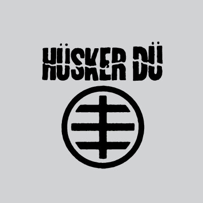
2. HÜSKER DÜ
The Hüskers were pretty much perfect in every way. Their logo was no exception. The logo is a symbol of their creative unity. Designed in-house (or is that in-band?), the circle represents the band as a whole, the horizontal lines the three members, and the vertical line is the creative connection running through them.
1. DEAD KENNEDYS
It’s so simple. It looks devious and dangerous and any kid (or malcontent office worker) can scrawl it perfectly on a binder. Winston Smith’s Dead Kennedys logo is the (black) flag bearer of the genre.
Smith himself said of the DK logo:
“I started with toothpicks and said "What can you do with four toothpicks?" I wanted to deliberately create something that was gonna be easy to make and evoke a certain kind of hard edged, severe imagery.”
