
Thirsty Rider Cycles
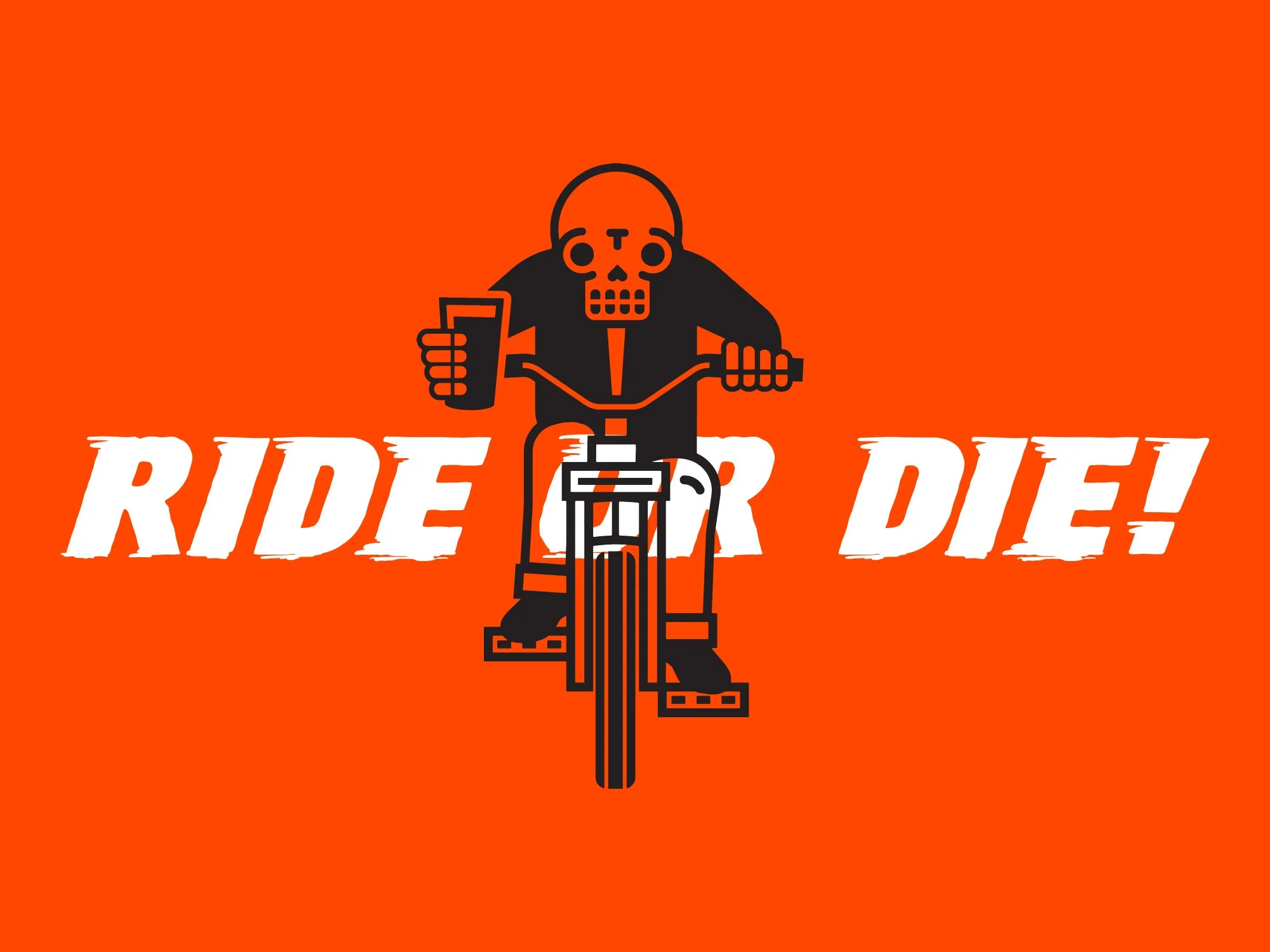
When your entire bike shop fits inside a van, every decision has to earn its place. That idea shaped the identity for Thirsty Rider Cycles from the beginning. Rather than relying on a single logo, we built a collection of marks and illustrations that could move with the business, appearing just as naturally on toolboxes, work shirts, stickers, merchandise, and the side of the van as they did online.
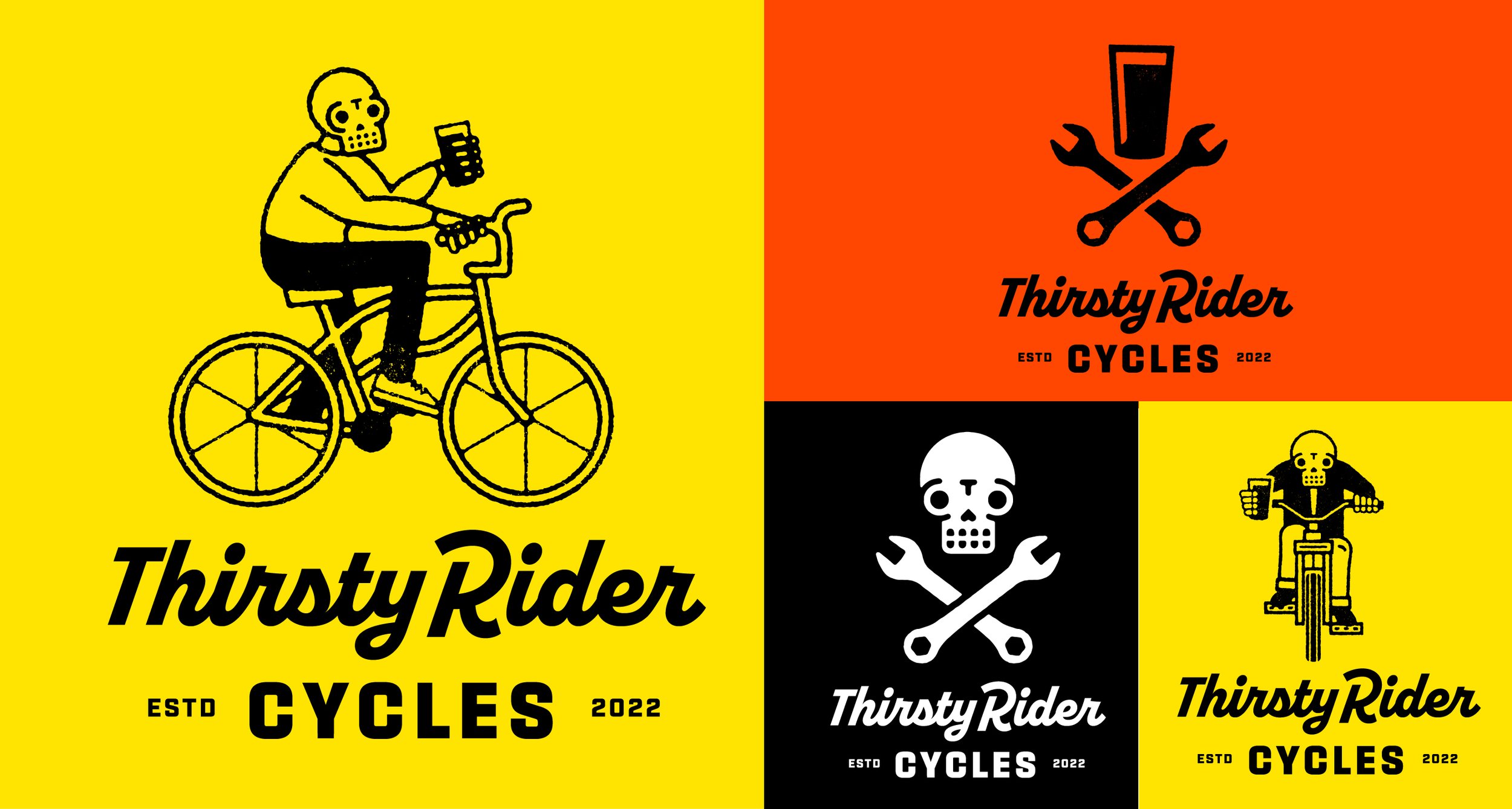
The work wasn't designed to stay pristine. It was meant to be used. Covered in grease. Faded by the sun. Scratched up alongside the tools that travelled with it. Like the business itself, the identity needed to feel practical, durable, and comfortable in the real world.
That approach reflected the person behind it. Brett Paulitsch wasn't interested in building a traditional bike shop. He wanted to spend his time fixing bikes, meeting riders where they already gathered, and becoming part of Edmonton's cycling community. The identity grew from that same philosophy, giving the business a visual system that felt as approachable and hardworking as the service itself.

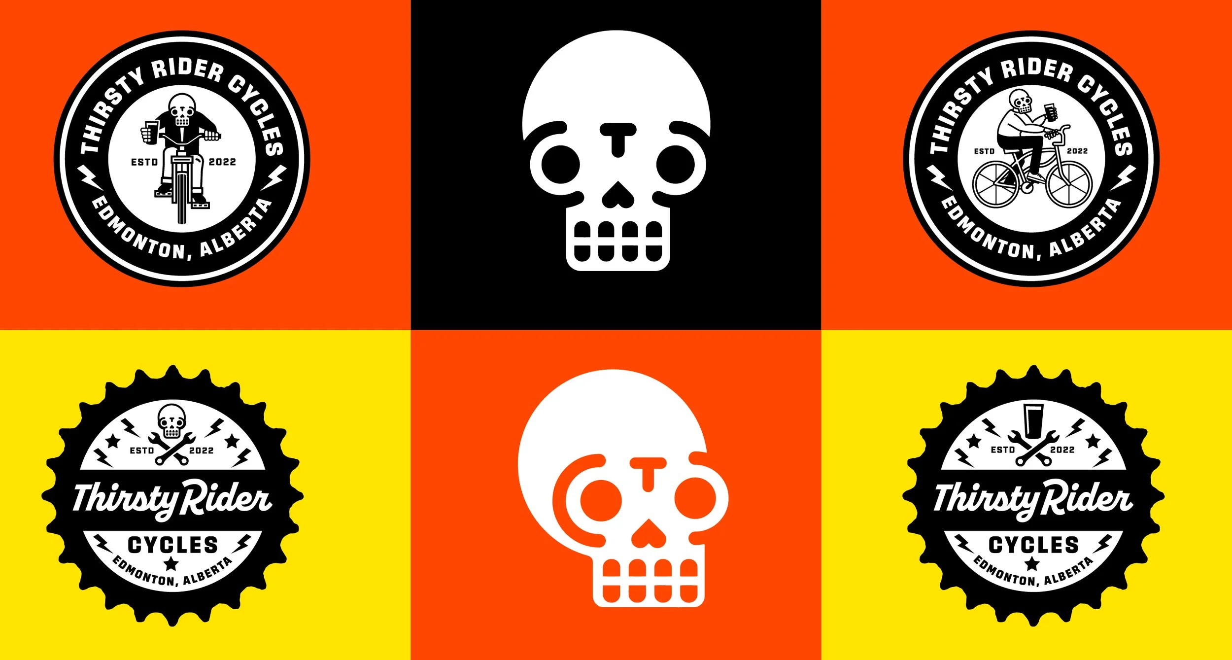
One of the most satisfying parts of a project like this comes long after the work leaves the studio. Seeing the identity continue to appear on the things it was designed for is a reminder that successful systems don't become meaningful on launch day. They become meaningful through use.